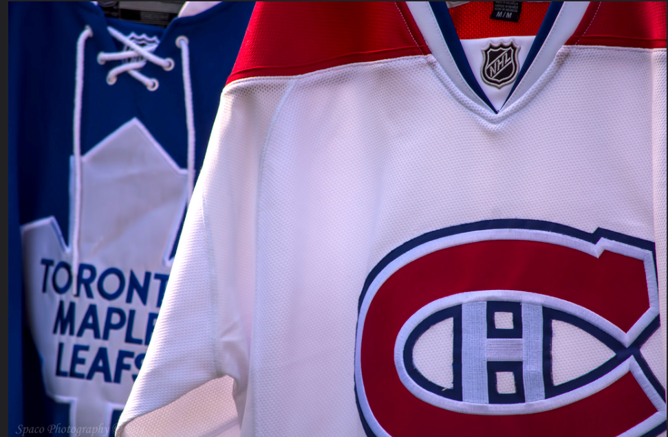
What Will The Adidas Third Jerseys Look Like?
NHL
When the NHL unveiled the new Adizero Adidas jerseys, third jerseys (or alternates) were taken out of circulation for the 2017-18 season. This was done to make the transition from Reebok to Adidas easier. This wasn’t the only time the NHL has done this, however. The League took away third jerseys for the 2007-08 season when they switched from CCM to Reebok. The following year Third Jerseys were back in circulation. Some teams had new designs while others stayed the same as before. This could be the case this time around. It will be interesting to see the designs for the Adidas Third Jerseys.
On June 22nd, the Carolina Hurricanes unveiled their new Adidas third jersey. As you can see below, the Canes went back to black. Only this time, their third jerseys have a new logo with two flags outlining the state of North Carolina. The jerseys have new red striping and grey shoulders. It looks pretty cool in my opinion.

Courtesy of Sportsnet.ca
Arizona Coyotes
The Arizona Coyotes have also revealed they will go back to the “Kachina” jerseys. They were used when the club first moved from Winnipeg in 1996. This is the first time the Coyotes have used third jerseys since the 2013-14 season. I think they look pretty neat and I love the green shoulders and the coyote playing hockey logo.
We wanted to create the most beautiful jersey in the world.
Then we realized, the most beautiful jersey in the world was already created.
Introducing our official @adidashockey third jerseys: pic.twitter.com/Ku9RHXLBSH
— Arizona Coyotes (@ArizonaCoyotes) June 22, 2018
Now it is only a matter of time other NHL teams will unveil their new third jerseys. It is rumored that 22 to 26 teams or even all teams will be participating in having third jerseys. Here are my predictions for each team’s design for their new Adidas Third Jerseys.
Anaheim Ducks: Orange Mighty Ducks
There is really no other option for the Ducks. It is rumored the Ducks will use the Mighty Ducks logo again. However, it is also rumored their Adidas Third Jersey will be black. We can’t say it is true or not but I don’t really like that idea. I think they will go back to the orange mighty ducks’ jerseys they had before. What I think they should really do is go back to the Mighty Ducks jerseys full-time and use the orange one as their third. Anaheim should ditch the webbed foot.
Hearing the new @AnaheimDucks third jersey may be black with this crest. That and other updates in #NHL #JerseyWatch today! #NHLDucks
READ: https://t.co/k4LIBiyfKt pic.twitter.com/d06zuv0c8v
— Icethetics (@icethetics) June 17, 2018
Boston Bruins: Throwback to the Bobby Orr Era

Courtesy of NHL.com
I never really like the bear under the word BRUINS stepping above the word BOSTON. For their new Third Jerseys, the Bruins shall go back to a time of greatness. I really like the yellow and white striping on these jerseys. The logo itself looks nice as well. I think Bruins fans would love a throwback jersey.
Buffalo Sabres: Royal Blue

Courtesy of Legends of Hockey
Buffalo has a colorful jersey history. Their current jerseys with the dark blue are among my favorites. They have some pretty bad ones like those yellow third jerseys. I predict they will also have a throwback to the 70s. The Sabres shall go back to the royal blue jerseys. They wore used at the 2018 Winter Classic. Fans really love these jerseys so it would be fitting to bring them back.
Calgary Flames: Retro 80s

Courtesy of NHL.com
The Flames will likely go back to these jerseys but with some slight changes to the striping. These are throwbacks to the 80s when the Battle of Alberta was huge and when they won the Stanley Cup. I never really liked the jerseys with the CALGARY mark on it. On these jerseys, I really like the yellow striping and the golden flame. It goes well with the red. This jersey really represents the Flames well.
Chicago Blackhawks: Black Jerseys

Courtesy of Imgur.com
I love these jerseys. The logo fits perfectly with the black background. The red and white striped truly represent the Blackhawks and the city of Chicago. Since the Blackhawks logo represents the first nations peoples, it is fitting that their jersey does as well. I am confident that these will be brought back.
Colorado Avalanche: Rocky Mountain

Courtesy of Yahoo.com
These are probably the best jerseys in the NHL. I love that logo. The Mountain is the symbol for Colorado and I like how it goes well with the C. The white shoulders and the sleeves being dark blue and burgundy look really cool. They have to go back to these ones without a doubt.
Columbus Blue Jackets: Cannon

Courtesy of Ebay.com
Even though it does not match the regular color scheme, the Blue Jackets should go back to the cannon jerseys. The cannon is a great representation of Ohio’s civil war history. The blue, grey and white stripes look decent. I always liked these jerseys because of the colors and the design. It really is a no-brainer that the Blue Jackets should go back to these.
Dallas Stars: Something New
I think the Stars should do something new for their Adidas Third Jerseys. Their home and away jerseys look really good especially the home ones. The Stars used the right shade of green, not too dark and not too light. I am eager to see what they will come up with if they try something new. Perhaps they should do something like this.

Courtesy of Dallas Kirkpatrick
Detroit Red Wings: 2016 Stadium Series Jersey

Courtesy of Yahoo.com
The Red Wings used these jerseys for their 2016 Stadium Series game against the Colorado Avalanche. They really should bring these back. These jerseys are one of my favorite jerseys of all time. The white sash with the sleek-looking D in the middle looks so cool. I heard a lot of fans in Detriot like these jerseys as well. I hope Adidas considers bringing these beauties back.
Edmonton Oilers: Blue Jerseys

Courtesy of NHL.com
I don’t mind the Oilers orange jerseys. However, I do not like the fact that they are the primary home jerseys. For their Adidas Third Jerseys, the Oilers should bring back the blue. The blue is the true Oilers jersey in my opinion. I get that the orange jerseys symbolize a new era in Edmonton but the blue should be brought back as a reminder of their great past. I always liked the Oilers jerseys. The combination of blue, orange and white looks great.
Florida Panthers: Probably Something New Or Might Not Get A Third Jersey
Sorry Panthers fans, I don’t know what kind of design the Panthers would have for their Adidas Third Jerseys. It is also likely that the team might not get a third jersey.
Los Angeles Kings: Royal Gold Jersey

Courtesy of NHL.com
Purple and Gold are the colors to represent royalty. Those colors are fitting for a team called the Kings. The crown logo looks great and so does the single purple stripe. These jerseys can also be throwbacks to the franchise’s early days.
Minnesota Wild: Green Minnesota Jersey

Courtesy of NHL.com
I usually don’t like words on a jersey but this is an exception. The Wild should use these as their thirds. No, they shouldn’t go back to their “Christmas” red and green jerseys. I never really liked those. The forest green look really represents Minnesota well. The words MINNESOTA WILD fit really well on the jersey. I would be disappointed if they don’t bring these back.
Montreal Canadiens: Unlikely To Get Third Jersey
Their logo and jersey are just so iconic.
Nashville Predators: Probably Something New or Won’t Get A Third Jersey
New Jersey Devils: Throwback Look or Something New

Courtesy of Yahoo.com
I think the Devils should go with a throwback look for their Adidas Third Jerseys. The green stripes and shoulders make an interesting look. I also think there is a possibility that they will go for something completely new. Maybe they should go with a black jersey.
New York Islanders: New Orange Look
Scott Dempsey's #Isles concept via @icethetics (https://t.co/r7yD7KYTJg)
This feels about right for what we'll see next season. Personally would like to see one set of the stripes removed for aesthetics and symbolism of Cups. pic.twitter.com/maYCQKVhqK
— Reagan King (@ReaganKingIsles) May 29, 2018
It is been rumored that the Islanders will go with an orange third jersey. It is not a bad idea, to be honest. This concept looks better than the Brooklyn Black Jerseys. I’m not a fan of this. The blue sleeves with the white stripes look great. However, it emphasizes more on New York but not Islanders.
New York Rangers: Statue Of Liberty Jerseys

Courtesy of HockeyWriters.com
What do people think of first when they hear New York City? Sure, the Empire State Building and Times Square come to mind but it is the Statue of Liberty. Lady Liberty is the iconic symbol of New York City. I always liked this jersey. The Rangers should bring back these jerseys. The Black look with the red and white make it quintessential New York City.
Ottawa Senators: O Jerseys

Courtesy of NHL.com
I always liked these jerseys better than the primary ones. The Red and White stripes look really cool. Plus, black looks really good on the Senators. They could go with a red jersey as well. The O jerseys are a no-brainer.
Philadelphia Flyers: Black Jerseys

Courtesy of officialflyersteamonline.com
The Flyers are rumored to have black Adidas Third Jerseys. They wore the ones for their Stadium Series game against the Penguins. The Flyers always had good jerseys and these look awesome. Black and Orange go really together. The orange sides look really cool.
Pittsburgh Penguins: Light Blue Look
/cdn.vox-cdn.com/uploads/chorus_asset/file/10856707/78691092.jpg.jpg?ssl=1)
Courtesy of vox-cdn.com
They wore light blue jerseys for the 2008 Winter Classic against the Buffalo Sabres. The Penguins really should bring these back. They might change a few things, however. The white shoulders and stripes go well with the light blue color scheme as it represents the Penguins well.
San Jose Sharks: Black Jersey
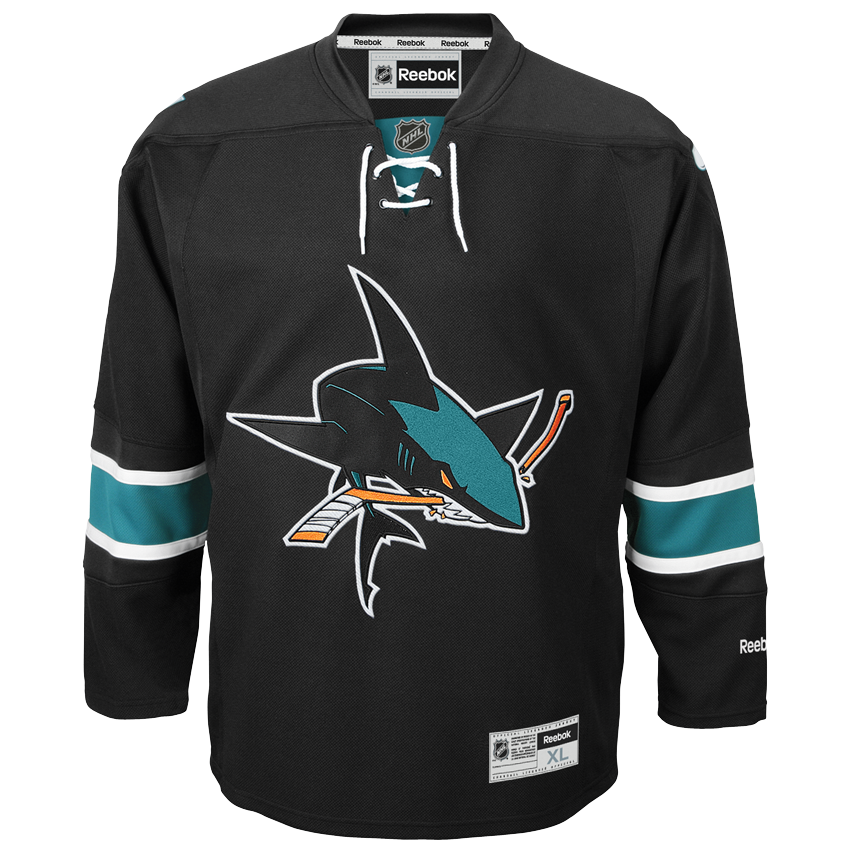
Courtesy of Ebay.com
The San Jose Sharks have some of the best jerseys in the NHL. They should go back to a black third jersey. The black jerseys look great with the chomping shark in the middle. The teal and white stripes on the sleeves are a bonus. Black really goes well with the San Jose Sharks because a shark is an intimating animal and these jerseys look intimidating.
St. Louis Blues: Dark Blue Arch Jersey

Courtesy of volusion.com
The arch is St. Louis’ landmark. It would be fitting to have it on a jersey. These jerseys are among my favourites. The dark blue and the white and yellow go very well. The Blues logo with the arch is a true representation of the city of St.Louis
Tampa Bay Lightning: Something New
After the Adizero jerseys were unveiled, the Lightning asked fans to help shape their Adidas Third Jerseys. The grand prize is an Adizero jersey autographed by a player of their choice!
Toronto Maple Leafs: Centennial Classic Look

Courtesy of NHL.com
The Maple Leafs used these jerseys in the Centennial Classic against the Detroit Red Wings. They should bring them back as their Adidas Third Jersey. They could make some changes to it as long it is some kind of variation of the Centennial Classic jersey. These jerseys are really cool. The Leafs logo with white in the middle looks awesome and so does the white on the arms with the blue. I really hope the Leafs wear something like this next season.
Vancouver Canucks: Flying Skate or Green Jersey

Courtesy of canucksarmy.com

Courtesy of vancitybuzz.com
Man, I love the flying skate jersey. Don’t get me wrong, I love the current orca look but the flying skate jersey just looks so awesome. The Canucks wore these jerseys from 1985 to 1997. They brought them back for a game against the Toronto Maple Leafs in the 2015-16 season. The demand for these jerseys to be brought back is high so it would make sense to use them as the Adidas Third Jersey. The flying skate logo is one of my favorite logos of all time and the black, red and yellow color scheme looks so great. If the Canucks try something new, they should go with a green third jersey like their AHL affiliate, Utica Comets. If they go for a green jersey, they should have the stick in the rink logo on it or even better, Johnny Canuck.
Vegas Golden Knights: Probably Won’t Get A Third Jersey
I could be wrong here. They might get an Adidas Third Jersey. I’m not too sure what the design will be if they do.
Washington Capitals: All American Look

Courtesy of capitalsoutsider.com
The Capitals should go back to the “All American ” jerseys. The red goes well with the blue and white stars and stripes. This jersey is fitting for a team based in the capital of the United States.
Winnipeg Jets: Throwback Jerseys

Courtesy of pinimg.com
For their Adidas Third Jerseys, the Jets should have a throwback look. The original Winnipeg Jets wore these before the team moved to Arizona in 1996. Bringing this jersey back would give Jets fans a feeling of nostalgia. The white stripes go well with the dark blue look as well as the red trim.


